Visualize various gradient descent algorithms
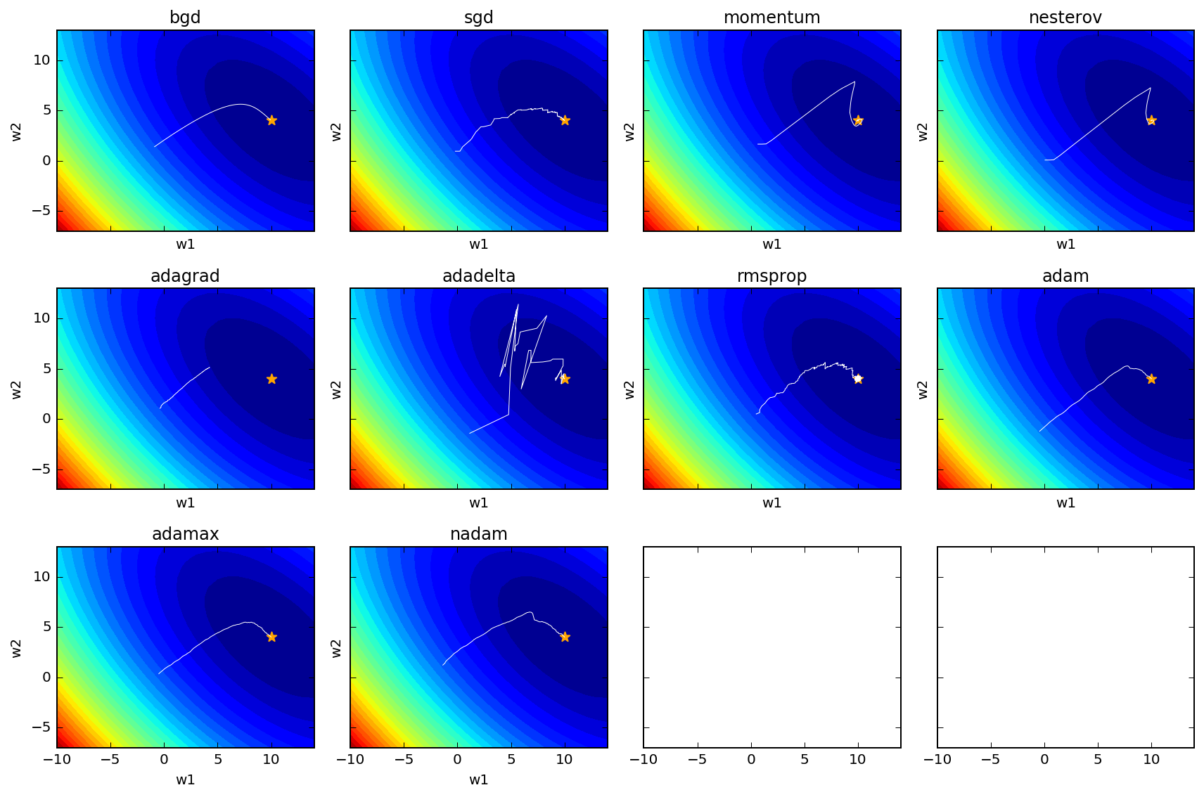
Recently, I implemented multiple gradentient descent-related optimization algorithms and applied to a simple loss function for visualization purpose.
The result look like such

Legend:
- The contour shows the surface of the loss function given the sampled data and the model function, a quadratic function with two parameters (w1 and w2).
- The star indicates the true parameter of the quadratic function, from which the data is sampled.
- The white line is the trajectory of gradient descent with the corresponding algorithm.
bgd: batch gradient descent; sgd: stochastic gradient descent.
Some comments:
- Batch gradient descent is the most smooth
- Stochastic gradient descent is more jumpy
- Plain momentum and Nesterov accelerated momentum (NAM) overshoot and then correct themselve
- Adagrad gets stuck as $G$ continues to increase adding squared gradients at each time step, effectively keeping reducing the learning rate to become infinitesimally small, thus learning gets halted.
- Adadelta fixed the diminishing problem of Adagrad, resulting in very jumpy trajectories
- RMSprop is quite similar to Adagrad, replacing $RMS[\Delta \theta]_{t-1}$ with $\eta$, but it doesn’t seem to be as good as Adadelta based on the above loss function trajectory.
- Adam looks good.
- AdaMax doesn’t look as good as Adam based on loss function
- Nadam performs similar to Adam
For details, please see this notebooks and code in here.
Please let me know if you have any comment or bug report.